Custom graphs help analyze oil, gas operations
The generation of custom graphs with Microsoft Excel enables an engineer or analyst to plot untransformed data for gaining an understanding of problems related to oil and gas operations.
Graphs have a visual appeal and facilitate the understanding of comparisons, patterns, and trends in data. Such software as Microsoft Excel or PowerPoint provides conventional (linear, logarithmic, or log-linear) graphs.
There are situations, however, when an analyst needs to plot data in other forms.
Plotting these types of data with Excel or PowerPoint requires data transformation before this software can be used.
This article will show how Excel's capabilities can generate custom graph forms that enable plotting untransformed data.
Custom graphs
Normal probability, lognormal probability, Hingle, and Weibull distribution plots are some of the more frequently used graphs for analyzing problems related to oil and gas operations.
Uses of normal and lognormal distribution include statistical analyses of exploration prospects, reserves, porosity, permeability, formation thickness, footage drilled by a drilling bit, and other variables involving uncertainty.
Well log data on the Hingle plot determine formation water resistivity (Rw), water saturation (Sw), matrix density (ρma), matrix travel time (Δtma), and potential pay zones. Also in well log analysis, the Porter et al. plot determines the zones containing hydrocarbon.
An extensive use of the Weibull distribution is reliability analysis, such as calculating the mean time to failure for planning facility maintenance activities.
Normal–probability graph
Due to implications of the central limit theorem, normal distribution is the most important probability distribution. Its graph, called the normal curve, is a bell-shaped curve extending indefinitely on both sides of the mean.
The distribution is specified by two parameters, a mean (μ, or P50) and standard deviation (σ). The distribution is denoted by N(μ, σ). These two parameters give the location and scale of the distribution, respectively.
The normal probability plot requires plotting the random variable on linear scale and probability on the probability scale. The plot provides a graphical technique for assessing
- Whether a data set is approximately normally distributed (straight line).
- Nature of the departure from normality (skewness).
- The mean (P50), standard deviation, P10, and P90.1
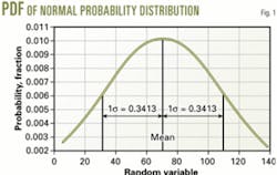
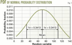
Fig. 1 shows a typical probability density function (PDF) of the normal probability distribution. An analyst finds the probability that a continuous random variable X takes on a value in a specified interval by determining the corresponding area under its PDF.
The mean divides the PDF into two halves, with 50% on each side of the mean. The curve has 68.26% of the population lying between ±1σ (one standard deviation) and 95.44% lying between ±2σ. Therefore, the area from one end of the PDF to one standard deviation above the mean is 84.13% (mean = 50% and 1σ = 34.13%).
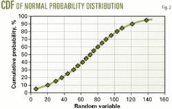
A corresponding curve (Fig. 2) to the PDF is the cumulative distribution function (CDF). The CDF indicates the probability that the outcome of X in a random trial will be less than or equal to any specified value of x. It corresponds to the area under the PDF to the left of x.
One calculates the area under the PDF by converting it into a standard normal curve with the equation z = (X – μ)/σ.
The standard normal curve is represented by μ = 0 and σ = 1, or N(0,1). The z, normalized value of the random variable, simply measures the distance from a given value of the random variable X to the mean value in units of standard deviation.
The =NORMSINV(probability) function of Excel returns the inverse of the standard normal cumulative distribution. One uses this function to construct the y-axis of the custom normal-probability chart.
Lognormal–probability graph
The lognormal distribution is defined with reference to the normal distribution. A random variable X has a lognormal distribution if its natural logarithm, Y = ln(X), has a normal distribution. The plot requires putting the random variable on a logarithmic scale and probability on the normal.
For either the normal or lognormal distribution, the user can specify P10 and P90 and solve for the mean and standard deviation or vise versa. The probability density function of the lognormal distribution is similar to the normal distribution except that it is skewed to one side.
This type of distribution has uses in environmental engineering, economics to represent distributions of returns on investment, insurance claims, and many oil and gas related problems.
The occurrence of oil and gas reserves shows a lognormal distribution.
Other examples of possible random variables represented by this type of distribution include core permeability, porosity, formation thickness, etc.
Hingle crossplot
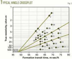
The Hingle crossplot requires plotting formation resistivity vs. porosity, bulk density or formation transit time (sonic) on a special graph. Fig. 3 shows a typical Hingle crossplot generated with Excel.
The plot shows bulk density or transit time on a linear (x-axis) scale and resistivity on a custom (y-axis) scale. The y-axis represents the Archie equation Fr = aφ–m, rearranged in the form aRt–1/m. The a and m depend on the type of formation. Therefore, sandstone and carbonate formations require different graphs.
The graph allows the analysis of long sections of well logs in a minimum time.
The points on the Hingle plot that are towards the upper left identify water-saturated formations. A straight line drawn through these points and extrapolated to infinite resistivity (Rt = ∞) represents the Ro line or Sw = 100% line. The intersection point of the x-axis and the Ro line represent φ = 0% and the correct formation matrix value.
An analyst can plot various water saturation lines to qualitatively identify envelops of formations with different water saturations.
Porter, et al., plot
Well log analysis uses the Porter et al. plot. It requires plotting a parameter P =[Rt(Δt – Δtma)m]1/2 or P =[Rt(ρma – ρb)m]1/2 vs. cumulative probability on normal-probability graph paper.
The plotted data result in an approximate straight line with the hydrocarbon zones being above the line to the right.
The parameter P has a square-root-normal distribution for zones with 100% water saturation.2
Custom graphs
Developing custom graphs requires mixing each situation's custom requirements and the built-in Excel chart functions. In all of the above-mentioned situations, the y-axis is customized and the x-axis uses Excel's chart functions.
If desired, however, both axes can be customized.
Initially, some effort is required to build the graph form according to the custom requirements. Once the graph form is ready, it can be readily used.
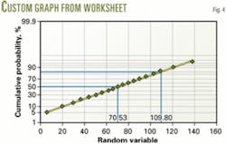
The worksheet in the box is used to develop normal-probability graphs (cumulative probability scale on y-axis and linear scale on x-axis). The other box shows the required steps in the process and Fig. 4 illustrates the plot generated by the steps.
Generating such graphs requires adequate skills, especially chart formatting, with Excel.
One can develop the Hingle crossplots in the same way. The Hingle crossplots have a linear x-axis scale and a y-axis represented by aRt–1/m. The parameters a and m are kept flexible so that the worksheet can be used for different formations. Generally, a = 1 and m = 2 for carbonates and a = 0.62 and m = 2.15 for sandstones.
The customized worksheets for the graphs are available free upon request from the author (see e-mail address in author's biography) and only require entering data in a data entry form. One can enter up to 32 XY data points.
In the graphs, regression on user-selected data pairs provide a best-fit line. The software then calculates all other parameters from this best-fit line.
The probability plot only requires a minimum of two data points. The software calculates the mean and standard deviation after entering P10 and P90, or calculates P10 and P90 after entering P50 and P84.13 (P50 + 1 standard deviation).
References
- Mian, M. A., Project Economics and Decision Analysis, Vol. II, Tulsa, PennWell Corp., 2002.
- Mian, M. A., Petroleum Engineering Handbook for the Practicing Engineer, Vol. I, Tulsa, PennWell Corp., 1992.
- Mian, M.A., PEPAC and PEPAC3 User Manuals.
Click here to download "Steps for Generating Custom Graphs". {pdf size=531kb}
The author
M.A. Mian ([email protected]) is an engineering specialist with Saudi Aramco, Dhahran, Saudi Arabia. He previously worked with Zakum Development Co. (ZADCO), Qatar Petroleum Corp., Keplinger & Associates Inc., and Euratex Corp. His career emphasis has been in reservoir engineering: reservoir evaluation and management, well test analysis, openhole well log analysis, economic evaluation, and risk analysis. Mian holds a BS in mechanical engineering, an MS in petroleum engineering, and an MS in mineral economics from the Colorado School of Mines. He is a registered professional engineer in Colorado and is a member of SPE.
